An image is worth a thousand words.
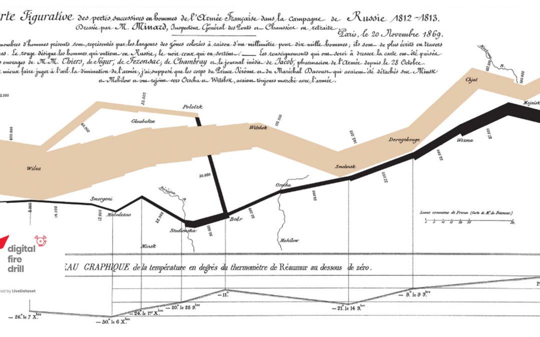
The “Flow Map” in the header is Charles Minard’s striking representation of the loss of life in Napoleon’s Russian Campaign of 1812: as the troops move West to East, the “brown river” progressively shrinks from 422,000 to 100,000. On the way back, the “black river” narrows to a trickle of only 10,000 revenants.
Tools…
Tech-wise, you no longer need Minard’s nineteenth-century drawing skills because today this is a problem solved: many clever BI tools allow you to join, aggregate, consolidate, render any set of data in a multitude of ways.
The individual is spoilt for choice: a user licence, a quick online course and a bit of trial-and-error, playing with ever smarter interfaces on well-bound datasets will deliver super-hero presentations in a flash.
…and More
For an organisation, it’s not so simple; an ideal architecture would enable anyone to cost-effectively access and share intuitive representations of the data they need (and are authorised to see) from any system, but the potential volume and variety of information presents many challenges ahead of any considerations regarding visualisation; to name a few:
- Quality: bad data will never deliver good charts, no matter how snazzy the tool.
- Structure: the way most systems store information requires rationalisation (e.g.: filtering, transformation, de-normalisation) for use in analytics and reporting, or you’ll be looking for needles in haystacks.
- Timing: time-sensitive analytics tend to require more targeted, ad-hoc approaches.
- Modelling: not everyone’s a data scientist… lots of data and powerful tools in the wrong hands = chaos.
- Credentials: how do you govern what people can access when you have a large number of information streams?
- Licensing: a server license for 1,000 “viewers” has a very different price to 1,000 “analyst/publisher” licenses.
Purpose as a yardstick
These kind of challenges are probably best addressed by focusing on purpose: ad hoc, operational, strategic?
The two extremes are easy to define (if not to optimally achieve):
- ad hoc needs will always exist and, by definition, they’ll be covered using a tailored approach, relying on the tools and expertise of a few domain experts;
- strategic information requirements will be predicated on a set of Key Performance Indicators (KPI) that any system in the firm should, in one way or other, report on, such as capacity, resiliency, $-impact. The agreed “rivers of data” would regularly flow into “lakes” from which experts may extract the necessary intelligence and make it accessible via dashboards.

Operational reporting is less straightforward. The average employee will regularly use a handful of “corporate systems” to participate in collaborative information exchanges, the bloodstream of business.
Each of these systems will have some reporting capabilities but not necessarily visualisation: in a world now dominated by distributed architectures there is a strong case for analytics and charting to be farmed out to specialised tools.
However, if the challenges outlined earlier are not successfully overcome, short-changed operational users will resort to ad hoc workarounds. The impact is difficult to quantify but will be most felt where data-driven efficiency, transparency, control are critical success factors.
The LiveDataset perspective
A LiveDataset solution could be equated to any one of the Systems A, B, C, D in the picture above, i.e.: an operational system working alongside others.
Until last year, we did not think we needed charts. Our primary focus, then and now, was enabling data collaboration in a distributed organisation – the green blob of the picture below:

We believed that analysing and charting the results was something external to the platform, that less was more.
Of course, when clients requested a specific dashboard to plot their transactions, inventories, risk registers or resource forecasts (LiveDataset allows you to define data structures for any kind of business process), we could always build a “custom portal” for them, something like this:

However, there was a clear imbalance:
- LiveDataset on the left > generic, flexible, configurable, ultra-fast;
- the Custom App on the right > bespoke, slower to deliver and scale.
So we upgraded our architecture to do this …

… and achieve an all-in-one, vastly improved, scalable integration of inputs and outputs…

… for a faster delivery of richer solutions with minimal (if any) coding.
This transformation happened because we realised that, when it comes to visualisation, more is more.
The ready-availability of operational charts does not mean that our APIs cannot be used to extract data for ad hoc analytics, or that our “data rivers” shouldn’t flow into a strategic “data lake”; it does, however, mean that when 1,000 users collaborate on a LiveDataset solution, they don’t need any other licence or separate user training to view real-time visualisations (fully aligned with their access credentials) of the data they work with everyday.
–
This piece is part of our Digital Fire Drills series.